Improving Billing with an In-House, Data-Rich Dashboard

Improving Billing with an In-House, Data-Rich Dashboard

Led the strategy to transition the user dashboard from a third-party portal to a native experience

UX Design

Strategy

API Integration

Design System

Brand Design

Improving Billing with an In-House, Data-Rich Dashboard

Led the strategy to transition the user dashboard from a third-party portal to a native experience

UX Design

Strategy

API Integration

Design System

Brand Design

22%

Increase in platform engagement rate

4

from 2.4 in Trustpilot reviews

33%

In retention, from 15% to 20% after release

Company

Resooma

Role

Designer

Design team

Just me

Year

2023 - 2024

Company

Resooma

Role

Designer

Design team

Just me

Year

2023 - 2024

Company

Resooma

Role

Designer

Design team

Just me

Year

2023 - 2024

Leading Design Within a Startup

As the sole designer, I worked to:


  • Aligned priorities with the CEO

  • Understand user pain points with the customer success manager

  • Release comms with the CMO

  • Ensure valuable data was pulling through the suppliers API for customers

  • Handover, launch and optimise the project with the CTO
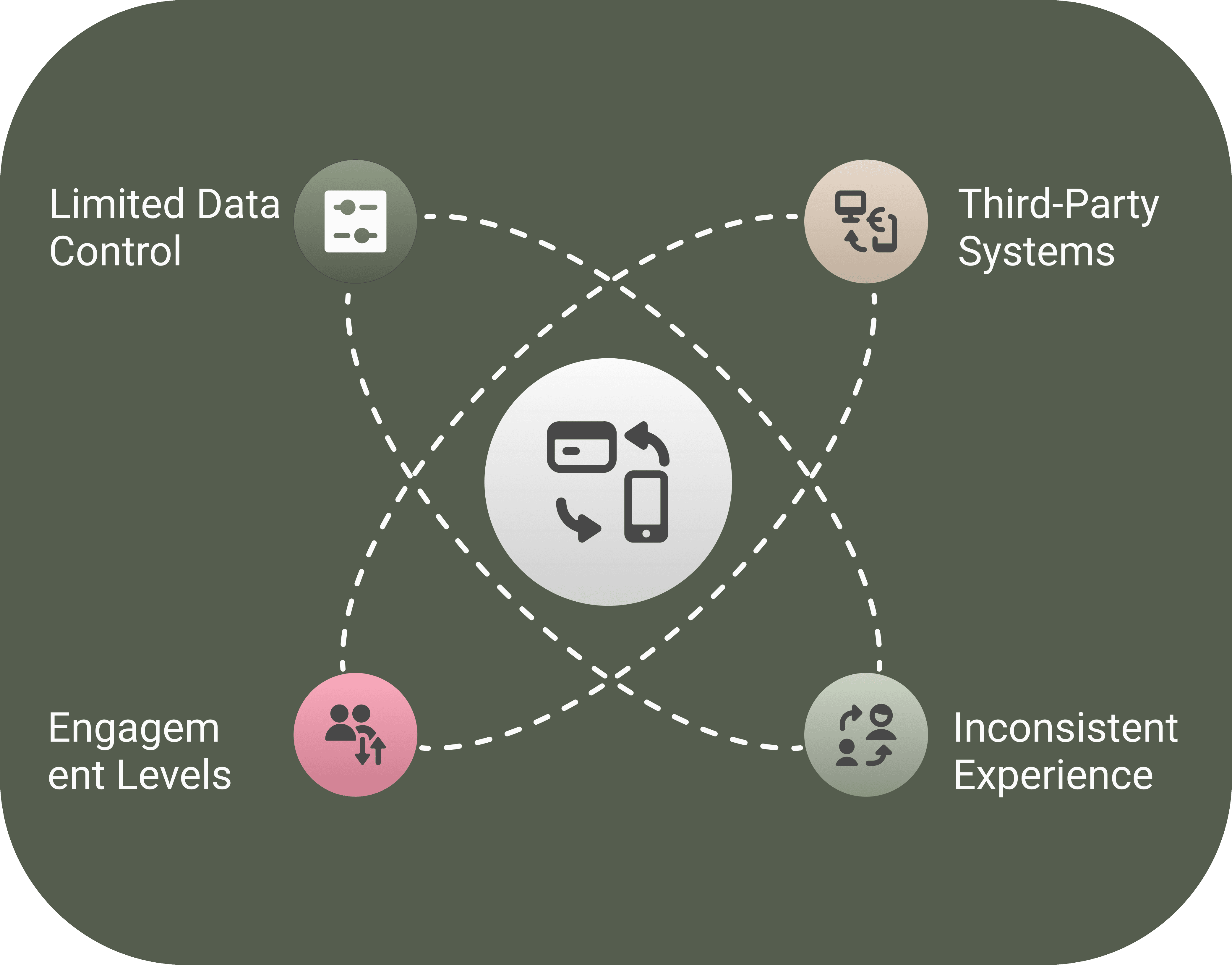
Business goals

Business goals

Business goals

Improve Retention

Provide a seamless, branded user experience where customers can understand and easily manage their accounts without friction

Improve Retention

Provide a seamless, branded user experience where customers can understand and easily manage their accounts without friction

Improve Retention

Provide a seamless, branded user experience where customers can understand and easily manage their accounts without friction

Increase Engagement

Increase Engagement

Increase Engagement

Encourage users to interact more with their accounts by removing barriers like third-party logins and disconnected data

Enhance Brand Trust

Strengthen credibility by ensuring all key billing and account data is centralised, transparent, and fully owned by the brand

Enhance Brand Trust

Strengthen credibility by ensuring all key billing and account data is centralised, transparent, and fully owned by the brand

Enhance Brand Trust

Strengthen credibility by ensuring all key billing and account data is centralised, transparent, and fully owned by the brand

The problem

The White-labelled Dashboard was Hurting Engagement and Brand Trust

The suppliers billing dashboard created an inconsistent experience, making renters feel disconnected. With limited control over the design and user journey, engagement dropped, and friction increased, hurting retention

The strategy

Reviewed the roadmap and platform to better align with Resooma's mission

I saw how our third-party billing system was hurting engagement and trust. I made the case to leadership to bring billing in-house - allowing full UX control and creating a seamless, brand-owned experience

The Solution

A clearer dashboard for easier bill management

I designed a native dashboard that simplifies billing, reduces friction, and creates a cohesive experience within our platform. Renters have more visibility and control over their bill management, leading to increased engagement and satisfaction

The problem

A Fragmented Billing Experience Hurt Engagement And Trust

The White-labelled Dashboard was Hurting Engagement and Brand Trust

The White-labelled Dashboard was Hurting Engagement and Brand Trust

Third-party billing created an inconsistent experience, making renters feel disconnected. With limited control over the design and user journey, engagement dropped, and friction increased, hurting retention

The strategy

Leading A Product Shift For Trust & Retention

Reviewied the roadmap and platform to better align with Resooma's mission

I saw how our third-party billing system was hurting engagement and trust. I made the case to leadership to bring billing in-house - allowing full UX control and creating a seamless, brand-owned experience

The Solution

A Seamless, User-Centred Billing Dashboard

A clearer dashboard for easier bill management

A clearer dashboard for easier bill management

I designed a native dashboard that simplifies billing, reduces friction, and creates a cohesive experience within our platform. Renters have more visibility and control over their bill management, leading to increased engagement and satisfaction

Making bill management effortless, clear, simple, and stress-free

Making bill management effortless, clear, simple, and stress-free

Making bill management effortless, clear, simple, and stress-free

From Mobile

From Mobile

From Mobile

To Desktop

To Desktop

To Desktop

Key Barriers Affecting Engagement and Retention

Key Barriers Affecting Engagement and Retention

Key Barriers Affecting Engagement and Retention

Third party portal

Billing details housed off the platform, questioned credibility of the service

Limited data visibility

Information visible was down to our partner company and it was limited


Lack of trust

Users didn’t feel a strong connection with the brand, making it easier to churn

Delving into the Design Process

Delving into the Design Process

Delving into the Design Process

Identifying pain points

Identifying pain points

Identifying pain points

Gaining Insights Through Support Tickets

Gaining Insights Through Support Tickets

Gaining Insights Through Support Tickets

Mapping the Journey

Log in & click
‘Your bills’

On billing page click a new link

Prompt to email

Click link in email

View billing dashboard

Log in & click
‘Your bills’

Prompt to email

View billing dashboard

On billing page click a new link

Click link in email

Log in & click
‘Your bills’

Click link in email

On billing page click a new link

View billing dashboard

Prompt to email

There were too many steps just to gain access to billing details and it was not properly branded

A clearer, more intuitive user journey

A clearer, more intuitive user journey

A clearer, more intuitive user journey

Original user flow

User logs

into Resooma

User can view billing details

Opens menu

Opens dashboard

Selects ‘Your Bills’ tab

Clicks ‘access secure billing dashboard’

Opens email

Clicks ‘sign into account’ button in the email

Magic link sent to user’s email

Loads billing dashboard on partners website

Updated User Flow

User logs

into Resooma

User can view billing details

Opens menu

Opens dashboard

Updated User Flow

User logs

into Resooma

User can view billing details

Opens menu

Opens dashboard

Updated User Flow

User logs

into Resooma

User can view billing details

Opens menu

Opens dashboard

Improving Usability, Reducing Friction, and Enhancing Clarity

Improving Usability, Reducing Friction, and Enhancing Clarity

Improving Usability, Reducing Friction, and Enhancing Clarity

Driving Data to the Bills Homepage

Before:

Lack of package information

Key information buried in text-heavy sections

No clear way to manage services, making users search for details

Bill lacks context, causing frustration & effort

Driving Data to the Bills Homepage

Before:

Lack of package information

Key information buried in text-heavy sections

No clear way to manage services, making users search for details

Bill lacks context, causing frustration & effort

Important actions were buried in text-heavy sections

Service management was unclear

Bill summaries lacked context

Visually structured and data driven homepage for an at-a-glance account summary providing immediate usability

Users had to re-enter their address, manually select meter types


Optional photo verification could lead to submission errors


The two-step process slowed users down

A streamlined, one-page flow with clear meter type selection


Made photo submission compulsory for accuracy to reduce error rates


Improved hierarchy for a more intuitive and quicker submission process

Driving Data to the Bills Homepage

Driving Data to the Bills Homepage

Before:

Lack of package information

Key information buried in text-heavy sections

Key information buried in text-heavy sections

No clear way to manage services, making users search for details

Bill lacks context, causing frustration & effort

Users had to re-enter their address, manually select meter types


Optional photo verification could lead to submission errors


The two-step process slowed users down

After:

A Streamlined, Intuitive Experience

A streamlined, one-page flow with clear meter type selection


Made photo submission compulsory for accuracy to reduce error rates


Improved hierarchy for a more intuitive and quicker submission process

Simplifying Meter Readings

Simplifying Meter Readings

Before:

A Frustrating, Multi-Step Process

No clear support for single vs dual readings

Signed-in users must re-enter their address, adding unnecessary steps and friction

Photo submission is optional, yet it's crucial for accuracy and verification

Important actions were buried in text-heavy sections

Service management was unclear

Bill summaries lacked context

After:

A Streamlined, Intuitive Experience

Visually structured and data driven homepage for an at-a-glance account summary providing immediate usability

Unifying the Experience Through API Integrations

Unifying the Experience Through API Integrations

Unifying the Experience Through API Integrations

Collaborated with in-house and external dev teams to integrate APIs for real-time billing and account updates
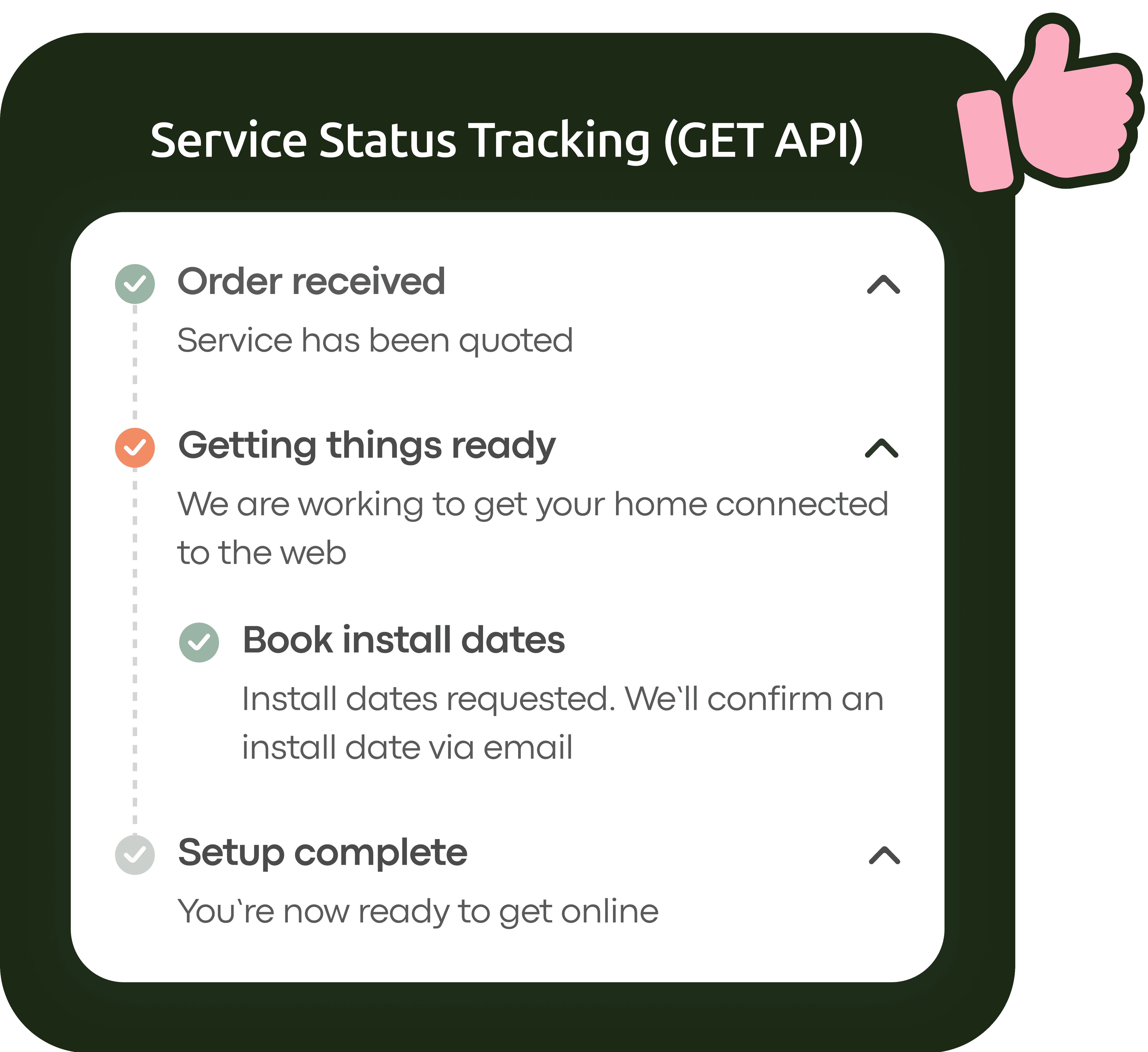
What we achieved

What we achieved

What we achieved

Real-time updates

Users receive real-time notifications at key setup stages

Setup progress tracking

Users can track setup progress anytime, reducing uncertainty

Impact

Impact

Impact

Increased transparency

Users know what’s happening


Higher engagement

Reduced support requests and greater trust in the process

What we achieved

What we achieved

What we achieved

Seamless submissions

Users can submit readings directly in the dashboard

Simplified meter readings

Eliminates extra steps, making it easier to complete

Impact

Impact

Impact

Higher submission rates

Easier access leads to more completed readings

Better monitoring

We can track submissions more effectively and address gaps

Why It Wasn’t Possible

Supplier restrictions

The supplier didn’t support automated payment date changes

Manual-only process

Changes were done on a case-by-case via the supplier

Key Takeaways

Temporary workaround

We guided users on requesting manual adjustments

Future potential

Opened discussions for API expansion to automate this process

The Final Experience

The Final Experience

The Final Experience

A Design System that Elevates Trust and Brand Perception

A Design System that Elevates Trust and Brand Perception

A Design System that Elevates Trust and Brand Perception

Ensuring consistency and scalability to reinforce trust, usability, and efficiency

Building Trust Through Thoughtful Design

A polished interface builds trust, aligning with the Aesthetic-Usability Effect - users perceive well-designed products as more intuitive. The redesign aimed to make the service feel seamless and trustworthy, ensuring that what looks good also works effortlessly

Creating Consistency with an Icon Library

An icon library was integrated into the design system to maintain consistency and efficiency. This ensures a cohesive experience while streamlining future updates

Leading A Product Shift For Trust & Retention

Creating Consistency with an Icon Library

Creating Consistency with an Icon Library

I saw how our third-party billing system was hurting engagement and trust. I made the case to leadership to bring billing in-house - allowing full UX control and creating a seamless, brand-owned experience

An icon library was integrated into the design system to maintain consistency and efficiency. This ensures a cohesive experience while streamlining future updates

An icon library was integrated into the design system to maintain consistency and efficiency. This ensures a cohesive experience while streamlining future updates

Building Trust Through Thoughtful Design

Third-party billing created an inconsistent experience, making renters feel disconnected. With limited control over the design and user journey, engagement dropped, and friction increased, hurting retention

A polished interface builds trust, aligning with the Aesthetic-Usability Effect - users perceive well-designed products as more intuitive. The redesign aimed to make the service feel seamless and trustworthy, ensuring that what looks good also works effortlessly

A polished interface builds trust, aligning with the Aesthetic-Usability Effect - users perceive well-designed products as more intuitive. The redesign aimed to make the service feel seamless and trustworthy, ensuring that what looks good also works effortlessly

By combining design psychology with a structured system, the dashboard redesign enhances usability, trust, and brand perception, laying the foundation for future growth

By combining design psychology with a structured system, the dashboard redesign enhances usability, trust, and brand perception, laying the foundation for future growth

By combining design psychology with a structured system, the dashboard redesign enhances usability, trust, and brand perception, laying the foundation for future growth

Updating Design Post Launch

Updating Design Post Launch

Updating Design Post Launch

Using session recordings to reduce friction and guide users to completion

The Assumption

A Seamless Checkout Experience

When designing the quote tool flow, we expected users to add a payment method during the quote process before seeing a success page. But once we launched, the data told a different story

The Reality

Users Were Dropping Off & Getting lost

47% of users exited before adding payment. When they returned, they expected to complete setup in the dashboard, but found no clear way to do so

Users Were Dropping Off & Getting lost

47% of users exited before adding payment. When they returned, they expected to complete setup in the dashboard, but found no clear way to do so

Users Were Dropping Off & Getting lost

47% of users exited before adding payment. When they returned, they expected to complete setup in the dashboard, but found no clear way to do so

The Fix

Guiding Users Back on Track

A 'Finish Setup' button was placed directly on the load-in page of the dashboard, so it couldn’t be missed. This removed friction and guided them to complete their payment effortlessly

Guiding Users Back on Track

A 'Finish Setup' button was placed directly on the load-in page of the dashboard, so it couldn’t be missed. This removed friction and guided them to complete their payment effortlessly

Guiding Users Back on Track

A 'Finish Setup' button was placed directly on the load-in page of the dashboard, so it couldn’t be missed. This removed friction and guided them to complete their payment effortlessly

The Result

A Smoother, More Intuitive Experience

Now users can pick up where they left off - without frustration

43% fewer daily support tickets - Users could now complete payment without contacting support

Higher payment completion rates - A clear CTA removed confusion

Reduced cancellations – A clear setup path led to fewer abandoned sign-ups

Key Learnings and Future Development

Key Learnings and Future Development

Key Learnings and Future Development

APIs Depend on

Supplier Data

APIs Depend on

Supplier Data

APIs Depend on

Supplier Data

Some features were delayed due to missing API data. Future versions will explore alternatives

Visibility Drives Engagement 

Visibility Drives Engagement 

Visibility Drives Engagement 

Clear account access reduces confusion and lowers support requests

Expanding Data Transparency

Expanding Data Transparency

Expanding Data Transparency

With the basics in place, future updates will introduce more billing insights

Lets chat over a

m

a

t

c

h

a

Lets chat over a

m

a

t

c

h

a

Crafted by Shen

Made possible with long sessions, coffee and matcha


2025

Lets chat over a

m

a

t

c

h

a

shenese.leigh@gmail.com

Copied

Crafted by Shen

Made possible with long sessions, coffee and matcha


2025

Lets chat over a

m

a

t

c

h

a

shenese.leigh@gmail.com

Copied

Crafted by Shen

Made possible with long sessions, coffee and matcha


2025

Lets chat over a

m

a

t

c

h

a

shenese.leigh@gmail.com

Copied

Crafted by Shen

Made possible with long sessions, coffee and matcha


2025

Lets chat over a

m

a

t

c

h

a

shenese.leigh@gmail.com

Copied